
If you don’t have the time to read the full article, here’s a 1 min GIF below. But if you do, I’d b happy if you read further:

The detailed explanation:
I was working on a demo to show the benefits of using a disconnected table when I decided to try and make something interesting out of it. A “disconnected table” is a table in your model explicit relationships to any of the tables in your model and can be used to affect measures without interfering with your model.
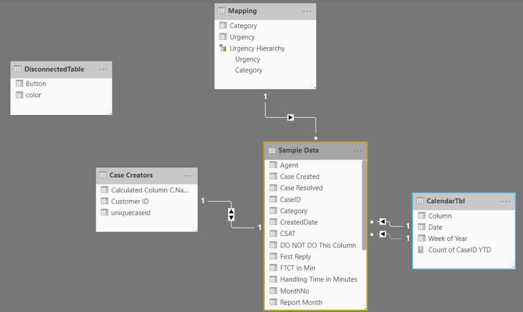
You can easily put a slicer on your canvas to emulate a selector – just remember to set “Single Select” to display radio buttons. Once this is done, you have the complete freedom how to use these values. In my case I did: 1) a measure returning either Blank or a calculation:
dynmeasure =IF (
SELECTEDVALUE ( ‘DisconnectedTable'[Button] ) = “Yes”,
[CaseCount],
BLANK ()
)
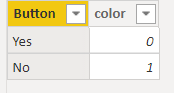
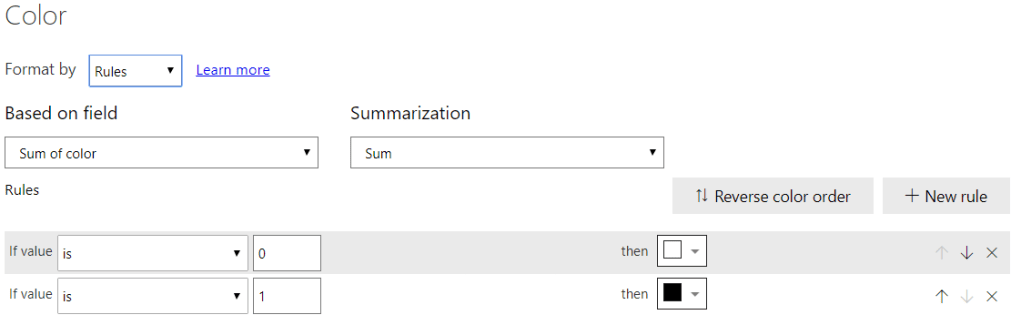
2) conditional formatting on the Card visual. There are many ways to do this but I took the simplest possible route (if a bit suboptimal): in the disconnected table I added a column containing the numbers 1 and 0 – selecting “Yes” or “No” would make the Sum of the color column 1 or 0, and thus – the colour of the card.
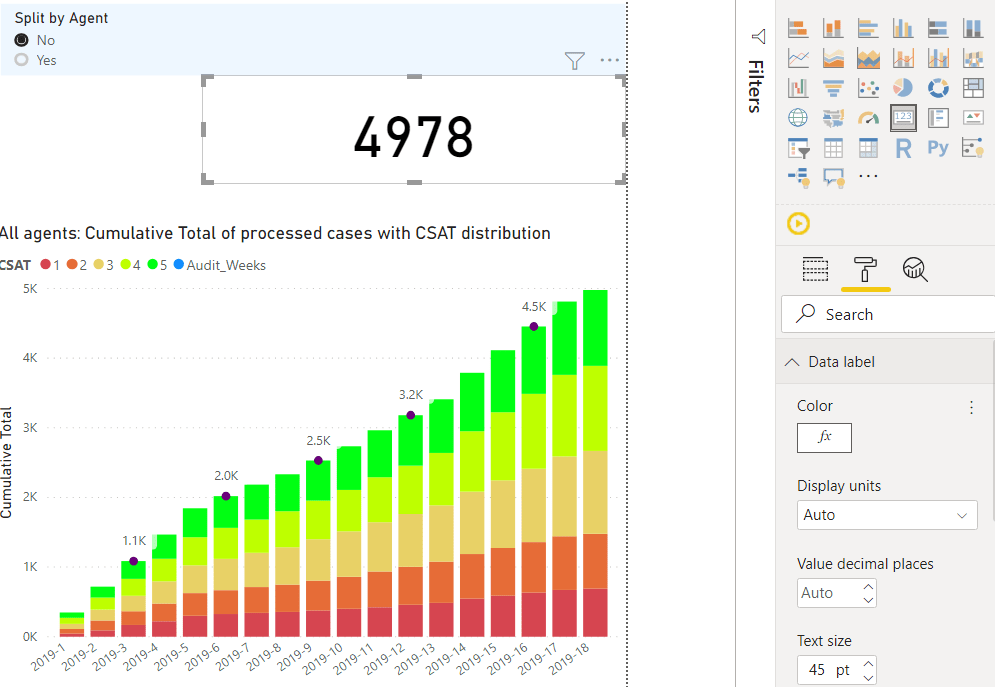
Layering: you can have the KPI on top of the chart and that is a way a friend of mine used to tackle this challenge. Now, while it is a bit faster to set up (you only adjust the conditional formatting of the card), it has the downside that the table is beneath and you can’t use it to make selections. So, I had the table on the top, I set the headers to white font & background and, as the measure returns a Blank value whenever “No” is selected, it won’t show any rows. Remember to turn the background of the table off so that the object behind it can be visible. In the example, I’ve demonstrated this with a single measure, but it is possible to use multiple measures in the chart, on the condition that they’re all subject to similar IF clause, bound to the same radio button.
Remember: unlike when using bookmarks, in this case both both visuals are calculated -this means there may be performance impact, depending on the complexity of the DAX expression(s) in the table and that of the model. On the other hand, the impact shouldn’t be too concerning as the IF statement controls whether the business calculation is to be executed. If you want to go for three or more visuals, that is doable as well. However, keep in mind that the users will be able to interact only with the uppermost object. In case you want to try three or more visuals, then I would suggest heavier usage of filter pane or a set of slicers – the reason is that different behaviour by that “single” visual would likely confuse some users).
Further ideas: combination of layering visuals with this technique and with bookmarks. This can be very interesting but a hard to maintain one as well.
Thank you for reading – and I hope you’ve enjoyed the article.
